Click the link to read the article on the NOAA website (Rebecca Lindsey and Brian Brettschneider):
Ever since NOAA declared El Niño to be officially underway in June 2023, people have been asking us what it would mean for summer heat. For most of the United States, the short answer has been “probably very little.” Or as the experts put it, El Niño doesn’t have a strong summer climate signal for most of the country. That’s true whether we look at departures from average temperature (anomalies) in summers leading up to El Niño, or whether we look at the frequency of warmer-than-average summers, which is what we are showing here.
For parts of the tropics, it’s a different story. Northern Hemisphere summers that lead up to El Niño winters do tend to be hotter than average across parts of northern Africa, India, and Central and South America. They also tend to be drier than average.
Exactly how often do these patterns occur? These maps show the scorecard for all 29 El Niño summers on record, 1950–present. For this analysis, which was done by Brian Brettschneider, a climate expert with the National Weather Service-Alaska, what we are calling an “El Niño summer” is any summer (June-August) leading into a winter (December-February) with El Niño conditions, regardless of whether El Niño was officially in place in the summer. (See “additional details” for an explanation of why Brettschneider chose to look at things this way.)
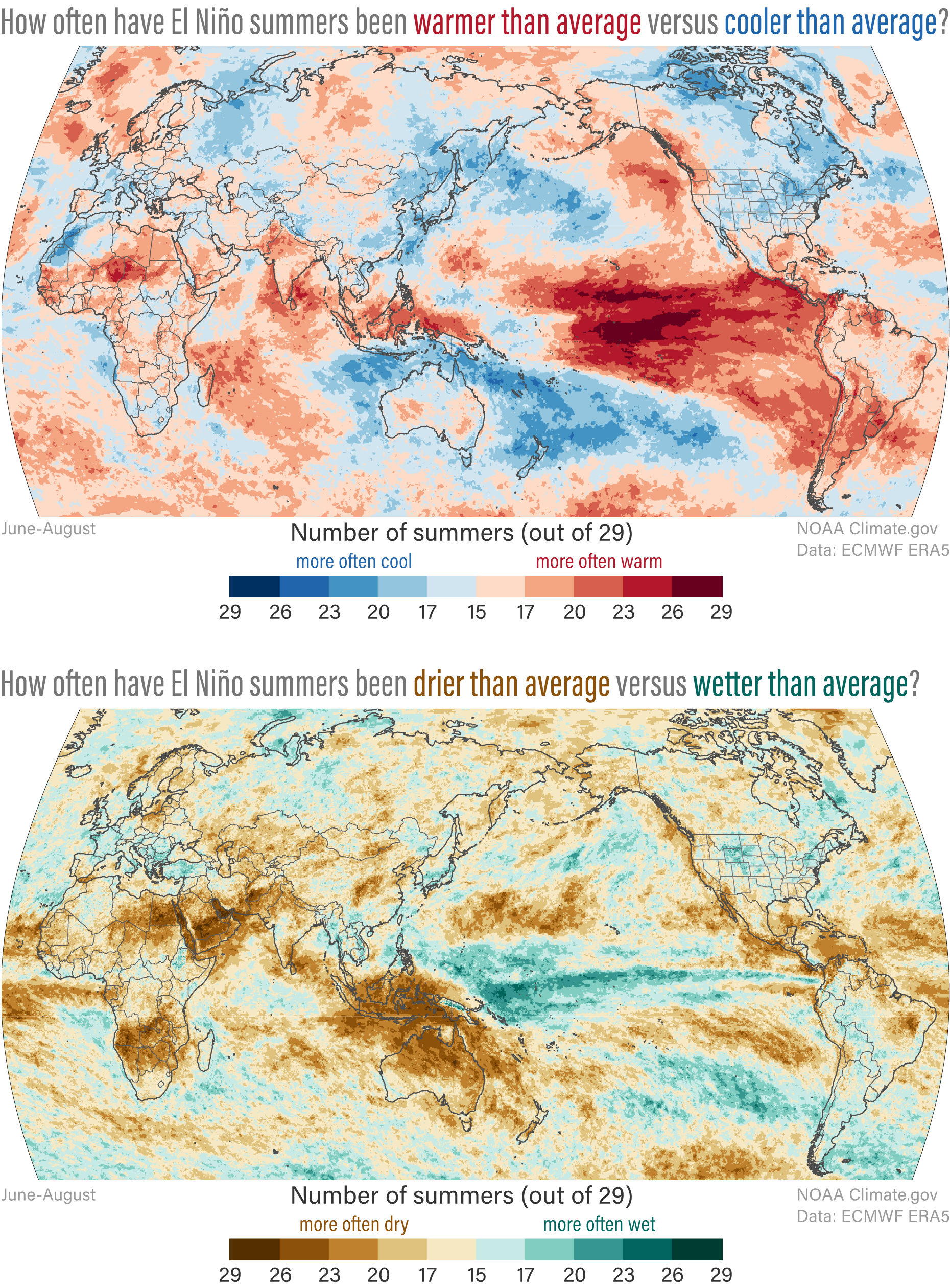
Not surprisingly, the only place where an El Niño summer was nearly always hotter than average (26 or more out of 29 years) was in the heart of the tropical Pacific, where above-average temperatures are literally part of the definition of El Niño. (If the coming winter wound up having El Niño conditions, the warmth would have been building there in summer, even if the temperature hadn’t reached official El Niño status at that time.) Across the tropics in places as scattered as the African Sahel and Hawaii, 20 or more out of 29 El Niño summers on record (close to 70 percent) were warmer than average. For many of those same areas, dry El Niño summers far outnumbered wet ones. Together those conditions significantly would have raised the risk of drought and fires in