Click the link to read the article on the Colorado Climate Center website (Peter Goble):
February 14, 2025
Happy Valentine’s Day! Every mid-February we take a day to let our romantic partners know how much they mean to us, or perhaps more cynically, to give money to Hallmark. Growing up, this was never one of my favorite holidays. For one, I was a nerd, and usually single. For two, I suffer from a tinge of seasonal affective disorder. Once the glow of Christmas, New Year’s, and a holiday break wears off, we are left to suffer through the remainder of the cold season with relatively few festivities. Growing up in northern Colorado my rule of thumb was always “things get better after Valentine’s Day.”
If you are somebody who is impacted by the short daylight hours and low sun angles, chances are you have already noticed things getting better. Here in Fort Collins, the sun rose at 7:21 AM and set at 4:37 PM on the winter solstice in late December. Today the sun rose at 6:54 AM and will set at 5:34 local time. That is over an hour and a half of improvement! Having said that, if you are somebody who is impacted more by cold temperatures than short days, yesterday morning’s low of -5 ˚F probably did you no favors. Of course, not every mid-February day is so cold, but even the average daily minimum temperature on Valentine’s Day is only 20 ˚F, just three degrees warmer than the average low in late December. Similarly, the mean daily temperature (daily max + daily min)/2 on Valentine’s Day is 33 ˚F, only 3 ˚F warmer than late December.
We know that the sun is our primary source of energy here on Earth, and we know that winter is cold because the northern hemisphere, in which we live, is tilted away from the sun. Conversely, summer is warmer because the northern hemisphere is tilted towards the sun, leading to longer days and more direct sunlight. The days are already getting much longer. Why are we not heating up more quickly?
As it turns out, at a large scale, the atmosphere takes about one month to adjust to an increase or decrease in solar forcing. This creates a cycle wherein changes in average temperatures lag changes in daylight by about a month. This plays out almost like a dance between light and heat where light leads and heat follows. To illustrate this point, I grabbed the Fort Collins 1991-2020 daily temperature normals data from SCACIS, and sunrise/sunset times for 2025 from timeanddate.com. A 15-day smoothing filter was applied to the temperature data for the sake of improved visualization (this means each day’s temperature normal is an average of the current day, and the seven calendar days before and after). The plot of our daylight hours throughout the year is nearly a perfect sine wave peaking at the summer solstice in June and hitting a minimum at the winter solstice in December (it is not a perfect sine wave because the earth’s orbit is not perfectly symmetrical). The plot of average temperatures similarly looks like a sine wave, but is phase shifted by about one month.
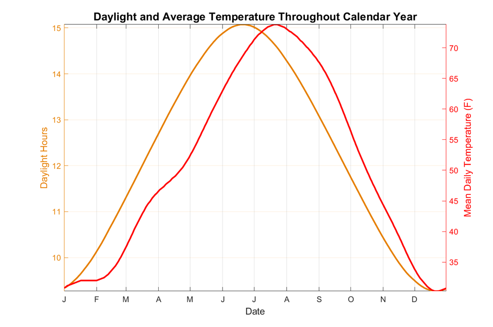
Light and heat’s annual dance is not perfectly choreographed here in Fort Collins, nor in most any other location. If you’re looking closely at these graphics you probably also noticed some asymmetries and additional wiggles in our average temperature curve. I want to talk about two of the main ones, which I will define with the following terms: the summer:winter asymmetry and the spring shimmy. The summer:winter asymmetry refers to the fact that average temperatures are at their lowest right around the winter solstice, but at their highest a full month after the summer solstice (July 20-24). Were this a dance, you could imagine light spinning heat out in the summer and corralling heat back in for the winter.
Our summertime average temperatures peaking in late July fits perfectly with the explanation above of temperatures trailing solar forcing. Temperatures reaching a minimum just about in lockstep the winter solstice does not fit with our above explanation. According to climatologist Brian Brettschneider, who wrote a tremendous blog post on seasons back in 2017, there is actually a dearth of scientific literature over why seasonal fluctuations vary from place-to-place the way they do. My hypothesis is that average precipitation is a bit higher on the northern Front Range in November and December than January and February, so there may be a slightly higher probability of cloudy conditions during this time, keeping averages lower in December than January.
The spring shimmy refers to the wiggle in average temperature’s increase in April. In our dance analogy, heat is accelerating pace to catch light, but does a toe drag. This behavior is much easier to explain. Fort Collins sees its highest average precipitation in late April through early June. We definitely see cloudier conditions around this time, and more of the sun’s energy goes into evaporation and transpiration during this time because of the wetter surface conditions. Both of these factors slow our warming pattern in spring.
The spring shimmy shows up even more prominently if we find a way to display both daylight and temperatures using one line on the same graph. In the image below I computed what we’ll call a “heat fraction” for each day of the year. This is computed as follows: [Current day average temperature – Lowest day average temperature]/[Highest day average temperature – lowest day average temperature]. The highest average daily temperature is 74F (in July) and the lowest is 30 F (in December). The formula above gives a unitless quantity with a max value of 1 (in July) and a minimum value of 0 (in December). As an example, the average temperature on October 1st is 56 F, so the heat fraction would be [56-30]/[74-30] = 26/44 = 0.59. I did the same for “light fraction” which uses the same formula above, but for daylight hours. Below I plotted the difference between the two: heat fraction – light fraction. It reaches a maximum value of +0.21 on September 8th and a minimum value of -0.3 on April 30th, right during our wettest time of year.

The temperature dataset actually includes some additional even smaller wiggles. My supposition is that these wiggles are mostly due to the fact that we are only using 30 years of data: 1991-2020. Our climate normals are just an average of wildly varying day-to-day weather conditions. Even though we used 30 years of data and applied a smoothing filter to the temperature dataset, there are still likely to be some small peaks and dips due to highly anomalous individual weather events. Take for instance December 2022 (see graph below): temperatures were mostly warmer than normal until right before Christmas when we quickly plummeted to a low of -17 ˚F. It takes a lot of years of data to fully smooth out events like this.

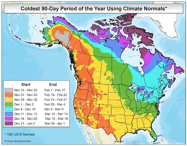
Other locations: Not all locations in the northern hemisphere experience their average peak summer heat or frigid winter weather at the same time. Using data from the National Centers for Environmental Information we can see that much of the country does experience the coldest weather in January rather than December. The image below from Brian Brettschneider’s blog shows that the start and end of the average coldest 90-day stretch of the year varies significantly across North America. The Arctic Circle does not see any sunlight all winter, so it is not surprising that the average coldest 90-day period is later: lasting from late December all the way until late March. Most of the country sees the coldest weather of the year between late November and late February, but the northeastern United States sees a bit longer lag with the coolest 90 days lasting from early December to early March. Conversely, most of North America experiences its warmest weather between early June and early September. Coastal areas tend to see their warmest weather a little later in the season because ocean waters heat up and cool down more slowly in response to solar forcing than land and air.

After all this information, I want to bring the focus back to my opening statement about seasonal affective disorder that “Things get better after Valentine’s Day.” We see in the data that our days are already getting longer, and at an accelerating pace. Furthermore, while average temperatures have not warmed much yet, they are certainly about to. The average temperature on Valentine’s Day is 33 ˚F, but one month later it’s 41 ˚F. Three months from now it’s 57 ˚F. Even so, winter is not over yet. This is neither medical nor even climatological advice, but my advice for staying happy during cold weather is to embrace it. February and early March is a perfect time of year for all sorts of winter fun like downhill and cross-country skiing, snowshoeing, and ice skating. You don’t even have to do anything fancy. When I go outside to walk in cold weather I rarely regret it unless conditions are also windy. In contrast, if I use cold weather as an excuse to hibernate, eat unhealthy food, and overconsume insipid short-form content on my phone, I regret that every time.