
Click the link to read the article on the NOAA website (Nat Johnson):
March 28, 2024
Last November, I wrote about how a strong El Niño might shape precipitation over the U.S. this winter (December – February). So, what happened? With crocuses now starting to bloom and the chirps of spring peepers in full chorus, we’re ready to investigate!
An El Niño-ish big picture
First, let’s acknowledge that a strong El Niño occurred this winter, as NOAA had been forecasting since issuing an El Niño Watch in April 2023. (If we couldn’t check that box, this would be a very short post!) We unofficially consider El Niño to be “strong” when the Oceanic Niño Index (ONI) exceeds 1.5 °C (2.7 °F), and the ONI value for this past December – February was well above that threshold at 1.8 °C.
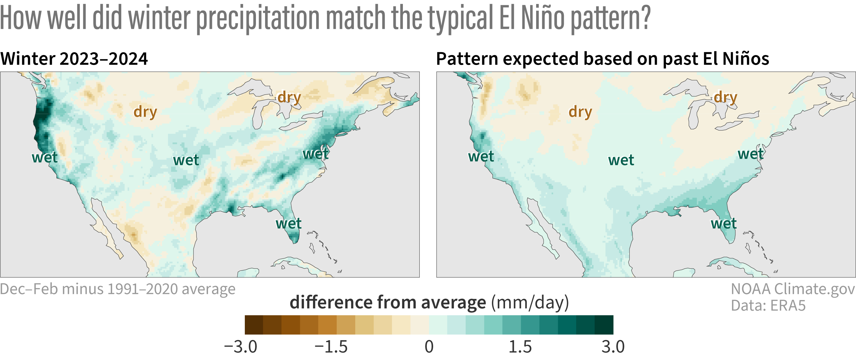
What happened with precipitation around the contiguous U.S.? Winter was wetter than normal overall, and as the map above and to the left indicates, wetter conditions were most pronounced across coastal areas, especially the West and Gulf Coasts and from the Mid-Atlantic to the Northeast. Wetter conditions also prevailed over most of the Central and Northern Plains. Drier-than-average conditions were much less expansive, but below-normal precipitation occurred around the Northern Rockies and portions of the south-central U.S. and extending southward into northern Mexico.
How much influence did El Niño have? If we compare the actual precipitation map for this winter with the expected winter El Niño precipitation pattern (1) to its right, we see a lot of similarities! In particular, the shifts in the jet stream induced by El Niño bring wetter conditions to the southern tier of the U.S., especially in California and the Southeast (with some mind-boggling atmospheric river events observed in California in particular).
At least by eye, we can affirm a decent match with the expected El Niño influence, but we’re scientists, so subjectivity alone isn’t going to cut it. To quantify the match between the actual and expected El Niño precipitation pattern, I will use a measure I used last November called the pattern correlation. To recap, values can range from -1 to +1, with values closer to +1 indicating a good match between the observations and typical El Niño pattern, values near 0 indicating no match, and negative values closer to -1 indicating an inverse match (observations look more like La Niña!). For some historical context, the pattern correlations between observations and the expected El Niño winter precipitation are shown below for all moderate-to-strong El Niños since 1950 (ONI values equal to or greater than 1.0 °C).
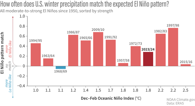
This past winter the pattern correlation was positive and around 0.3, which is a reasonably good match between what we saw and the expected El Niño precipitation pattern. Moreover, most previous moderate-to-strong El Niños matched the expected pattern at least as well as in 2023/24. There are some exceptions, like the winters of 1968/69, 1957/58, and most recently 2015/16, but the figure above supports the general rule that El Niño’s fingerprints are conspicuous whenever El Niño is at least of moderate strength.
What about the differences?
Of course, we shouldn’t just sweep the mismatches under the rug. There were many backyards this winter that did not experience the typical precipitation impacts for an El Niño of this strength. In particular, the Pacific Northwest and Northeast were considerably wetter than the expected El Niño pattern, while portions of the southern tier from southern Texas to the Southeast were notably drier.
So, why did we experience these deviations from the expected El Niño precipitation pattern? And, perhaps more importantly, were there other climate signals that were predictable? The answers to these questions require more thorough analysis than I can provide here, and I’m sure that scientists will try to come up with the answers in the coming months and years ahead (stay tuned for next month’s post!). Nevertheless, we can take a stab at seeking some early clues.
Fluttering butterflies?
We first have to consider the most boring and most frustrating possible culprit for the discrepancy – the chaos of weather or internal variability. Recall that when we consider our computer climate models – like from the North American Multi-Model Ensemble (NMME) – we look at the average of up to hundreds of individual forecast maps. This average, called the ensemble mean, filters out the influence of seasonally unpredictable, random weather and retains the seasonably predictable signal, like from ENSO. The NMME average forecast for this winter (2), shown in the top left below, closely resembles the expected El Niño precipitation pattern and features similarities with this past winter.
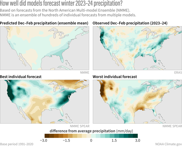
However, if we look at the hundreds of individual forecast maps that went into the ensemble mean, we see the influence of chaotic weather that can either support or oppose the pattern that actually occurred. In fact, if we search the 300+ forecast maps to find the one that best matched the actual pattern this winter (bottom left above), we see that it captured many notable features of this winter, including the very wet conditions in the Pacific Northwest, Mid-Atlantic, and Northeast.
Don’t be fooled, however – there was no way to know, in advance, that that prediction, out of the 300+ maps, would be the “best” one! We know this because we can find the worst-matching pattern (bottom right above), and we see a nearly opposite pattern, with a dry West Coast and Northeast! Both the best and worst forecasts were run in the same model forecasting system with the same El Niño, so most differences are likely attributable to the noise of random weather or internal variability.
Searching for a melody beneath the noise
Just because random, internal variability could be responsible for most of the differences between this past winter and the El Niño pattern, that doesn’t mean we’ve reached the end of our story. It’s still possible that some of the differences could be caused by other predictable factors, such as ENSO flavors, other climate phenomena, or long-term trends. One way to get an inkling of this possibility is to compare the NMME average forecast (ensemble mean) with the expected El Niño precipitation pattern. Because the NMME average has filtered out the effects of random weather, differences should be attributable to factors that are seasonally predictable, at least in climate model world.
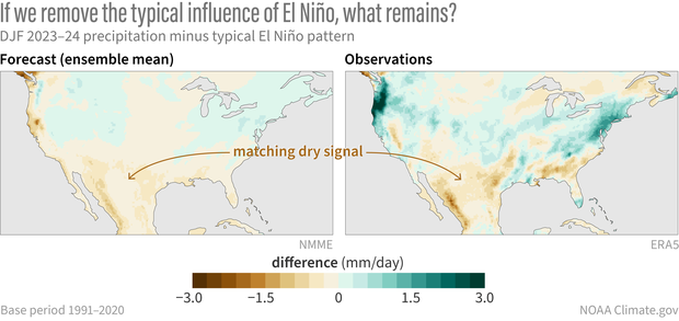
When we look at the observed deviations from the expected winter El Niño precipitation pattern in both observations (above, right) and the NMME average (above, left), we do, in fact, see some similarities! In particular, the NMME forecast indicated drier conditions over the southern tier of the U.S. and Mexico than we would expect for an El Niño of the strength that occurred. This suggests that the unusually dry conditions in this region may relate to a seasonally predictable signal beyond ENSO. We cannot rule out that some of the other observed deviations also may have been predictable but that our current forecast models were not up to the task – our models are improving but they’re still far from perfect! (3)
As mentioned above, it will take more digging to understand what factors may have resulted in any predictable deviations from the classic El Niño precipitation pattern this past winter. We’re in luck because next month Michelle will share some recent work by Dr. Clara Deser and Dr. Stephen Yeager that sheds some more light on what else might have been predictable alongside El Niño. I’m excited about this, so you definitely will want to check back next month!
Footnotes
- As in my November post, I calculated the “expected winter El Niño precipitation pattern” as the linear regression of December-February precipitation anomalies on the Niño-3.4 index from 1952-2022. This gives a map of precipitation anomalies (in mm/day) per change in the Niño-3.4 index (in °C). The difference between my calculation here and in the November post is that here I then multiplied the regression map by the observed Niño-3.4 index for this past winter (1.8 °C) so that the map is now scaled by strength of the El Niño that actually occurred. Therefore, the expected winter El Niño precipitation pattern represents the precipitation anomalies we would expect for an El Niño of the strength that just occurred, and we can make an apples-to-apples comparison with the observed precipitation pattern.
- As I wrote in November, I averaged all the forecasts produced in September, October, and November of this year from 7 different NMME models. Each model has a set of forecasts (ranging from 10 to 30) with slightly different initial conditions to sample the different possible realizations of chaotic weather variability. The NMME precipitation map was produced by averaging 324 individual forecast maps (108 for each of September, October, and November).
- Note that the NMME also predicted drier conditions along the West Coast that did not actually occur. It is not clear if this model error is a result of random weather variability or a seasonally predictable signal that the models did not correctly capture.
