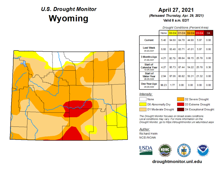
Ninety-five percent of Wyoming is abnormally dry or worse, according to a nationwide drought monitor map released Thursday.
The pervasive dryness may have significant near-term impacts on grazing and irrigation, and could result in down-stream calls on Wyoming water as early as next year, experts say.
The current conditions statewide mark a seismic shift from a year ago when only 2% of the state registered abnormally dry or drier, according to the National Drought Mitigation Center at the University of Nebraska-Lincoln.
The driest areas — classified as “extreme drought” and covering 6% of Wyoming — span parts of Carbon and Natrona counties, plus small areas in Sweetwater and Fremont counties. There, a poor snowpack will produce runoff “inadequate for ranching and farming,” the center says.
Only parts of Sheridan, Johnson, Big Horn and Park counties are at or above normal moisture levels.
The monitor map, updated monthly, shows “exceptional” D4 drought — the driest condition on the center’s scale — in parts of Utah and Colorado and other areas of the southwest, but not Wyoming.
Western residents are already feeling the effects. Early season wildfires in the Black Hills of South Dakota caused Gov. Kristi Noem to declare a state of emergency there through June 1. Southwestern water scarcity along the Colorado River may curtail water use in other states but shouldn’t affect Wyoming this year, said Steve Wolff, head of the State Engineer’s Office Interstate Streams Division…
Snowpack vs runoff
This week remote monitors measured the water content of the snowpack statewide at 89% of median, according to Fahey’s weekly report. The Powder and Tongue rivers in the northeast had the highest readings at 129% and 124% of normal respectively. The Upper Bear River Basin in western Wyoming measured lowest at 57% of median…
“Even though the snowpack is almost 100%, runoff [could be] 50%, give or take,” Wolff said. “A lot of that water is just going to soak into the ground.”
[…]
The drought map shows that about 40% of Wyoming suffers from moderate, D1, drought, a level in which hay and forage yield is low, fire danger is elevated, fewer wildflowers bloom and less irrigation water is available.
“Severe, D2, drought” affects another 39% of Wyoming, stressing trees and reducing water pressure in some wells. In D2 drought, pastures are poor, overgrazing occurs and producers begin to sell cattle, according to the center.
See-saw changes in recent weeks saw areas west of the Continental Divide dry out. “Much of that area, especially in Teton County, was the one part of the state that had been doing quite well in terms of the drought map,” said Tony Bergantino, acting director at the Water Resources Data System in the Wyoming State Climate Office.
But last week severe drought, D3, moved into Teton County for the first time since 2016, he wrote in an email. That severe drought also grew to cover a large area of Lincoln County.
NOAA’s new U.S. Climate Normals give the public, weather forecasters, and businesses a standard way to compare today’s conditions to 30-year averages. Temperature and precipitation averages and statistics are calculated every decade so we can put today’s weather into proper context and make better climate-related decisions.
Normals may be familiar to most Americans by their inclusion in local daily weather information from television, radio, print, and digital media. Not only do Normals indicate how conditions measure up for the nation as a whole, but also for specific locations—from Bangor, Maine, to San Diego, California. And, from Nome, Alaska, to San Juan, Puerto Rico.
U.S. Climate Normals are designed—and best-suited for—better understanding what is happening today. Rather than assess long-term climate trends, Normals reflect the impacts of the changing climate on our day-to-day weather experience. Normals are not merely averages of raw data. Thirty years of U.S. weather station observations are compiled, checked for quality, compared to surrounding stations, filled in for missing periods, and used to calculate not only averages, but many other measures. These then provide a basis for comparisons of temperature, precipitation, and other variables to today’s observations.
Supplemental Normals for the 15-year period 2006–20 are being released simultaneously with conventional 30-year Normals for users who require information for periods closer to the present.
Why Update U.S. Climate Normals?
Member states of the World Meteorological Organization (WMO) are required to calculate their country’s normals at ten-year intervals. Countries follow recommendations by the WMO, which provides a framework for international cooperation among meteorologists, climatologists, and hydrologists.
The decadal update is the equivalent of the Census for those who use the dataThe decadal update is the equivalent of the Census for those who use the data. It replaces the previous set of U.S. Normals, which cover all 50 states and U.S. territories such as Puerto Rico and Guam. NCEI and its predecessors have been the official source for U.S. Climate Normals since the 1950s. New data come from approximately 8,700 National Weather Service stations operated by NOAA, which include Automated System Observing Stations (ASOS) and Cooperative Observer Program (COOP) stations.
For the first time, Precipitation Normals have been created for more than 770 Snow Telemetry (SNOTEL) stations managed by the U.S. Department of Agriculture and for more than 5,400 citizen science observation stations from the Community Collaborative Rain, Hail, and Snow (CoCoRaHS) Network. Calculating and making available the new averages is a significant undertaking that requires months of preparation by a team of climate scientists, including NCEI partners from the Cooperative Institute for Satellite Earth System Studies (CISESS) and NOAA Regional Climate Centers (RCCs).
Several new Normals will be introduced for the first timeNormals provide information about national and localized average temperature and precipitation as well as other parameters, such as snowfall, heating and cooling degree days, frost and freeze dates, and growing degree days. Several new Normals will be introduced for the first time, including Seasonal Normals representative of different states of the El Niño/Southern Oscillation (ENSO) and High-resolution Gridded Normals, which are data that represent Climate Normals at 5 km intervals north and south across the contiguous U.S. to allow for easier calculations and mapping of climate averages and departures from normal. New Normals access tools will also be forthcoming from our RCC partners.
2021 Normals Table via NOAA.
By comparing averages to weather observations, anyone interested in the conditions at specific locations can learn whether a variable is above, below, or near average. For instance, the average temperature during the February 2021 Arctic air cold outbreak in the Dallas–Fort Worth area was 42°F below normal on February 16, according to the 1991–2010 Normals.
Along with the National Weather Service (NWS) and meteorologists and forecasters in the private sector, the new Normals impact the work of numerous public and private stakeholders, including the energy and agricultural sectors of the American economy, building design, infrastructure, construction, and several governmental organizations, such as the USDA.
Changes Since 1981–2010 Climate Normals
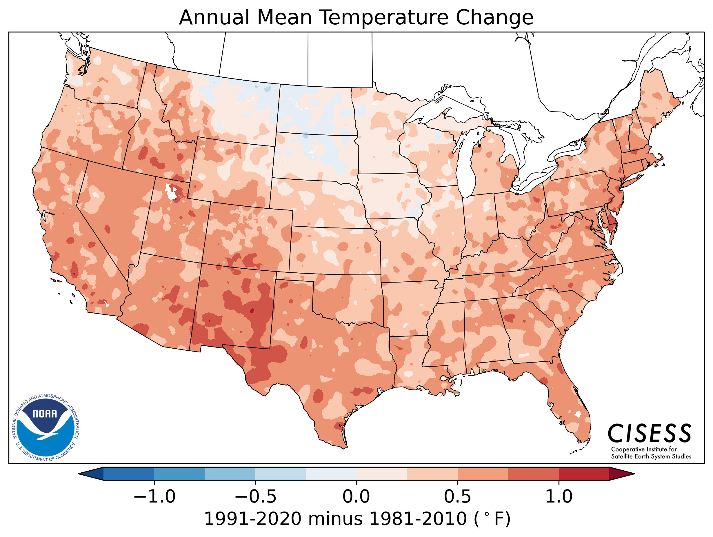
Changes can be subtle, depending on the region, season, and timeframeAs anticipated, changes have occurred in averages since the last ten-year update. Since two-thirds of the data (1991–2010) in the new set overlap with the previous version, changes can be subtle, depending on the region, season, and timeframe. Nonetheless, an upward shift in temperature averages is evident, but warming is not ubiquitous across the contiguous U.S. in either geographic space or time of year. Changes vary from season-to-season and month-to-month.
For instance, the north-central U.S. Temperature Normals—for those in the Northern Plains and Upper Midwest—have cooled from 1981–2010 to 1991–2020, especially in the spring. The South and Southwest are considerably warmer. Normals were also generally warmer across the West and along the East Coast.Precipitation-wise, the Southwest was drier; wetter averages emerged in the U.S. east of the Rocky Mountains, especially the Southeast in the spring.
Average annual temperature change in degrees Fahrenheit for the contiguous U.S. from the 1981–2010 U.S. Climate Normals to the newest data in the 1991–2020 Normals, released by NOAA, May 2021. Averages indicate a warming pattern occurred in all but portions of the Upper Midwest and Northern Plains. Courtesy of CISESS.Annual U.S. precipitation changes by percentage from the 1981–2010 U.S. Climate Normals to the newest data in the 1991–2020 Normals, released by NOAA, May 2021. Decreases indicate a drier Southwest, and increases indicate wetter sections of the Northern Plains, Great Lakes region, and Southeast. Courtesy of CISESS.
In the transition to the new set of Normals, shifts in the relative frequency of above- and below-normal conditions will occur. Shifts will be most discernible in areas of the country undergoing substantial warming in the last decade, as experienced in the West and Florida. In those cases, comparisons of averages to current conditions will trigger below-normal temperature days more frequently. This does not mean that conditions are “colder” in the absolute sense; in actuality, higher averages have raised the bar for warmth.
Climate Normals and Climate Change
U.S. Normals are useful to understand present-day conditionsRather than track or define long-term trends or changes in climate, U.S. Normals are useful to understand present-day conditions. For climate monitoring activities at NCEI, longer periods are referenced. The monthly State of the Climate reports produced for the United States and globe use twentieth-century averages (1901–2000) as benchmarks and will continue to do so. The yearly Bulletin of the American Meteorological Society State of the Climate report also relies on longer periods of record.
Several reasons underlie the use of the twentieth-century averages for climate change monitoring:
The 1901–2000 baseline offers more consistency as conditions change over time and is not subject to updates every 10 years.
The period is an easy-to-understand range when discussing long-term climate change with non-technical audiences.
However, long-term trends from decade to decade can affect baseline “normal” weather conditions. For instance, the last decade includes the warmest seven years on record for the globe, according to NCEI.
Future Releases
Additional products and services will be released later in 2021 and into 2022, including Daily Gridded Temperature and Precipitation Normals. Plans are also underway for NOAA NCEI to become a repository for climate normals from countries around the world.
Thousands of amateur meteorologists across the United States help the National Weather Service track weather patterns by performing a daily task – checking the temperature and precipitation amounts on their property. These citizen scientists record and report their findings to the agency, every day.
Daily temperature and precipitation observations collected by volunteer cooperative observers and Automated Surface Observing Systems are used by NOAA scientists to develop the 30-year average of weather and climate data, known as Climate Normals, set to update on May 4.
“Forecasts are for today, observations are forever,” said National Weather Service Director Louis W. Uccellini, Ph.D. “Thanks to all of our cooperative observers. Your work is key to sustaining the climate record as we compute the average temperatures over the last 30 year period.”
The National Weather Service Cooperative Observer Program, launched in 1890, is a network of over 10,000 volunteers gathering observations at roughly 8,100 weather stations located on farms, in urban and suburban areas, in National Parks, and on seashores and mountaintops. There are observers in every state and U.S. territory from Palau to Puerto Rico.
“The century-long accumulation of weather observations taken by volunteer observers provide a baseline to compare yesterday’s weather and tomorrow’s forecast and establish record amounts,” said National Cooperative Observer Program Manager Amy Fritz. “The climate normals dataset are critical to several weather-related functions and help inform activities in many economic sectors such as agricultural, energy and travel.”
Farmers and pilots were early adopters to the importance of weather observations
Farmers know crop growth success is closely related to the weather. Monitoring local climate was and is a constant for them. In the early 1900’s, many farmers felt it their duty to the country to record and provide valuable weather data to the National Weather Service. Many cooperative observer weather stations have been passed down in families for generations. For 165 years, the Maddox Family from Rome, Georgia has provided the longest continuous record by a cooperative observer. As for farming locations, the Wright Family of Redrock, New Mexico, has been taking observations from their 320 acre farm for multiple generations.
In 1926, the Air Commerce Act directed the National Weather Service to provide weather services to civilian aviation, so pilots would have information they needed to fly safely. This led the way for gathering weather observations at airports. Today, airports across the country have Automated Surface Observing Systems – instead of taking manual observations – gathering weather data to support airport operations and provide input for the climate record.
More than 900 ASOS stations in the U.S. have been in continuous service for almost 30 years. Providing observations every minute of every hour of every day, each station includes sensors to measure wind speed and direction, dew point, air temperature, precipitation type and amount, visibility, cloud height and thickness, and station pressure.
Assuring accuracy of local surface temperatures and precipitation is a challenging and evolving undertaking. Daily reports from the Cooperative Observer Program along with data from Automated Surface Observing Systems are quality controlled first by National Weather Service meteorologists then by a comprehensive sequence of automated computer procedures at NOAA’s National Centers for Environmental Information (NCEI). In some cases, additional manual quality assessments are performed at NCEI.
“If NOAA says a record temperature was set, you can trust that record,” said Fritz.